
Designing: Either Way
It’s Toast ✨
It’s Toast ✨
Creating a Retro-Groovy Logo for Internet Personality Heb
When internet personality Heb (@hebontheweb) reached out about creating a logo for Either Way It’s Toast, it was immediately clear this project was about more than just a visual mark. The logo would serve as the face of a proof-of-concept video for a pilot TV episode—a fast-moving, high-visibility moment meant to communicate tone, personality, and potential in just a few seconds on screen.
With over 202k followers and a strong track record of viral content, Heb brings a rare mix of charm, humor, and cultural relevance. My goal was to design a logo that felt unmistakably her: playful, confident, retro, and built for motion and storytelling.
About the Client
Heb is a content creator known for catchy, often silly songs and videos that tackle everyday issues and body positivity. Her work resonates because it’s funny, honest, and deeply relatable. From short-form viral hits to longer-form concepts, her brand balances humor with heart—and that balance became a key north star for the logo.
Either Way It’s Toast needed to feel like it belonged in the same universe as her content: bold, animated, and immediately memorable.
The Starting Point
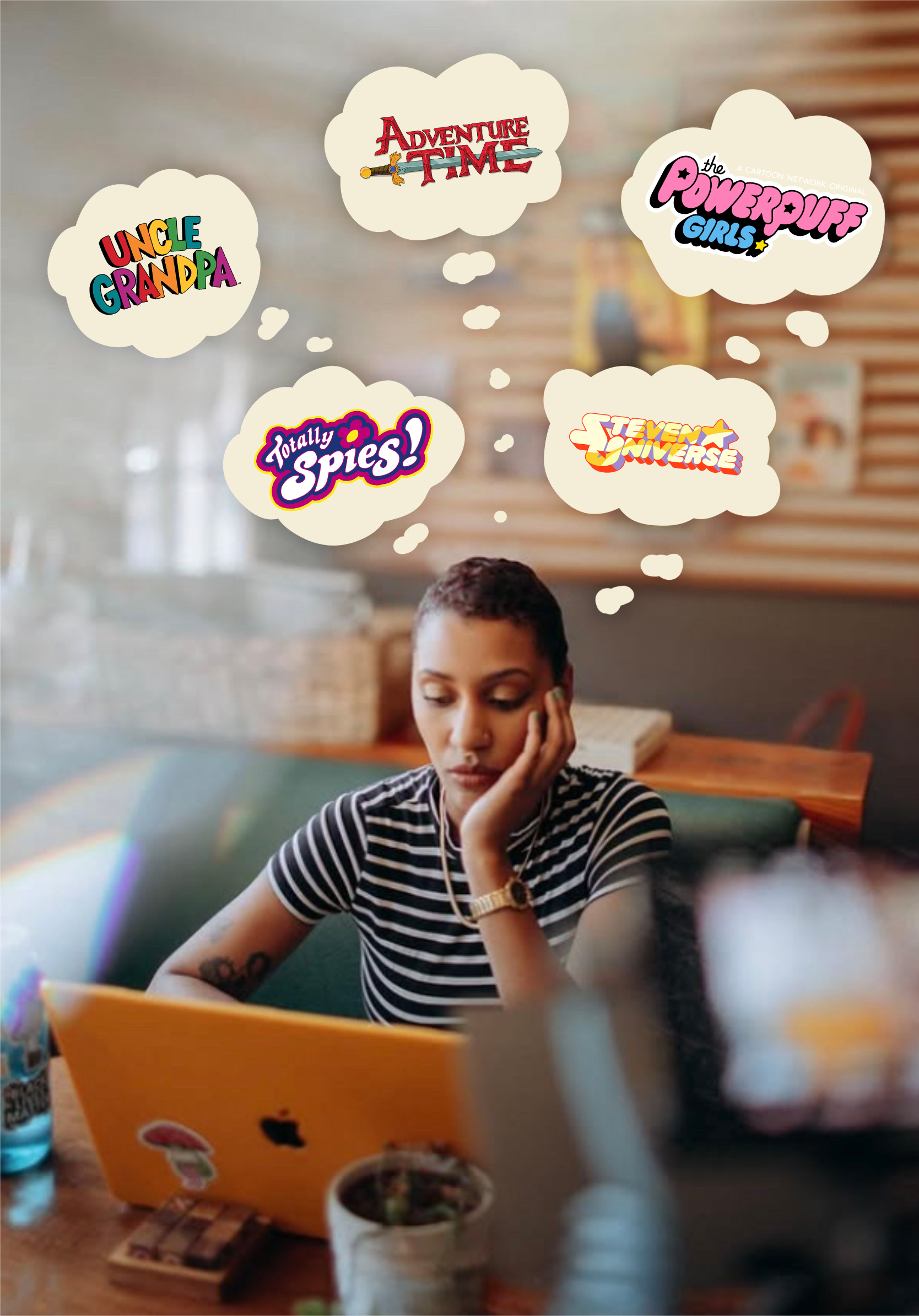
We began with a Canva logo Heb had already created, which served as a helpful foundation. Even at this early stage, her vision was clear: a retro, groovy vibe with a playful tone.
To further define the direction, Heb shared several animated show logos that inspired her, including:
• Steven Universe
• The Powerpuff Girls
• Totally Spies
• Uncle Grandpa
• Adventure Time
These references made it clear we were aiming for something bold, expressive, and animation-ready—something that could live comfortably in a cartoon-inspired world while still feeling fresh and modern.
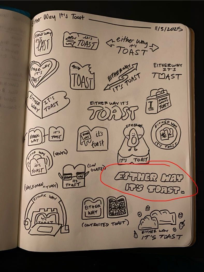
Sketching the Direction
Based on our conversations and visual references, I started with hand-drawn sketches exploring different wordmark structures, letter shapes, and overall energy. Sketching allowed us to move quickly and experiment freely without getting bogged down in details too early.
Heb selected her favorite direction from the sketch page, and from there we transitioned into digital exploration.
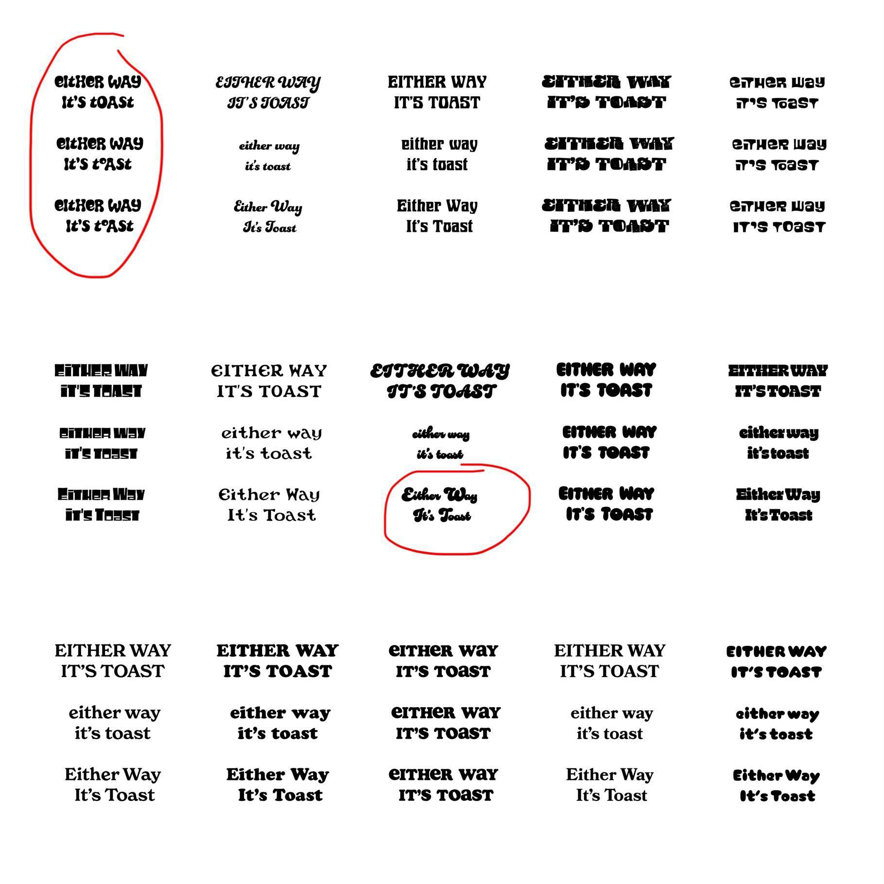
Typography Exploration
Once in digital, typography became the main focus. I curated a selection of fonts that aligned with the retro-groovy feel and presented them as potential bases for the logo. Heb narrowed the options down to two favorites, which we then pushed further.
Using those two fonts, I created a full page of logo variations, experimenting with:
• Visual treatments
• Weight and proportion
• Drop shadows inspired by her original logo
From there, we refined the shadow depth and angle, gradually narrowing the field until one font clearly stood out.
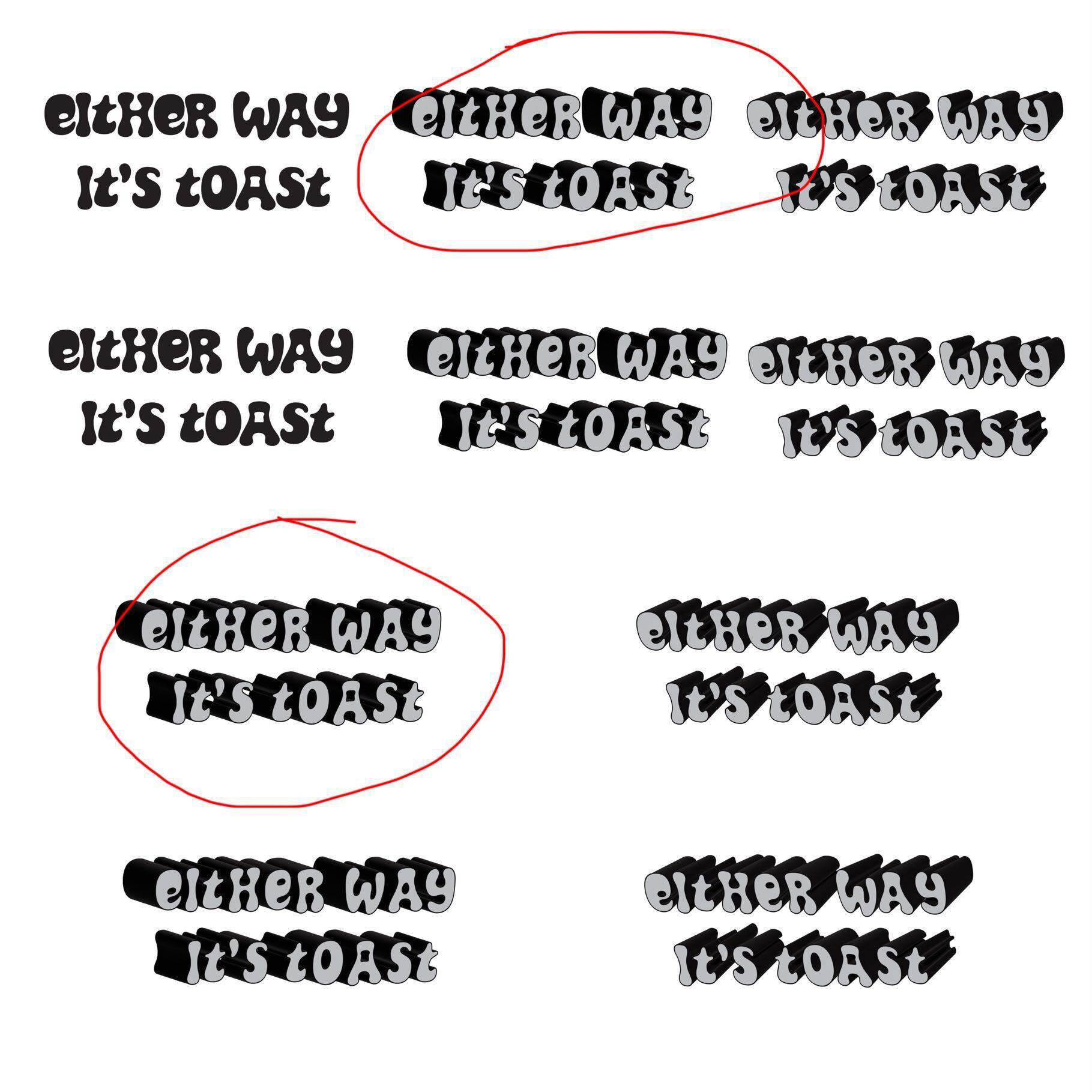
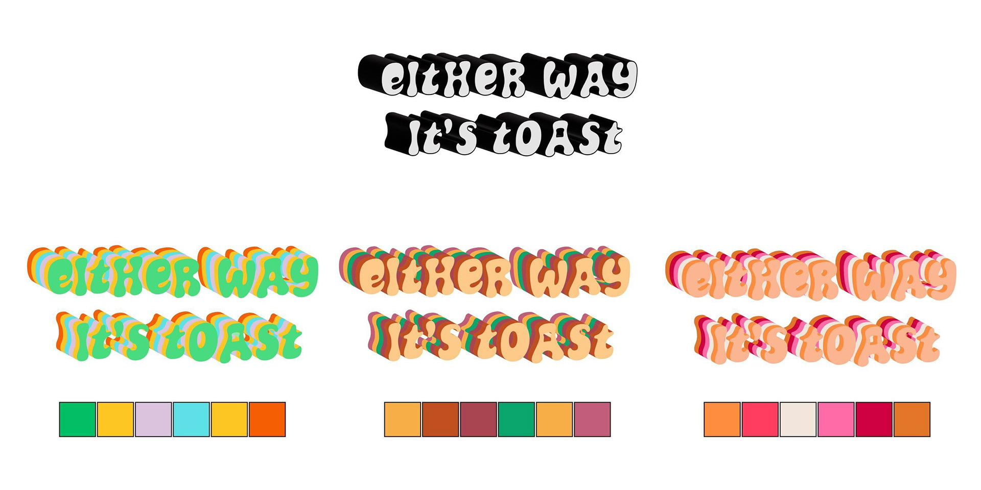
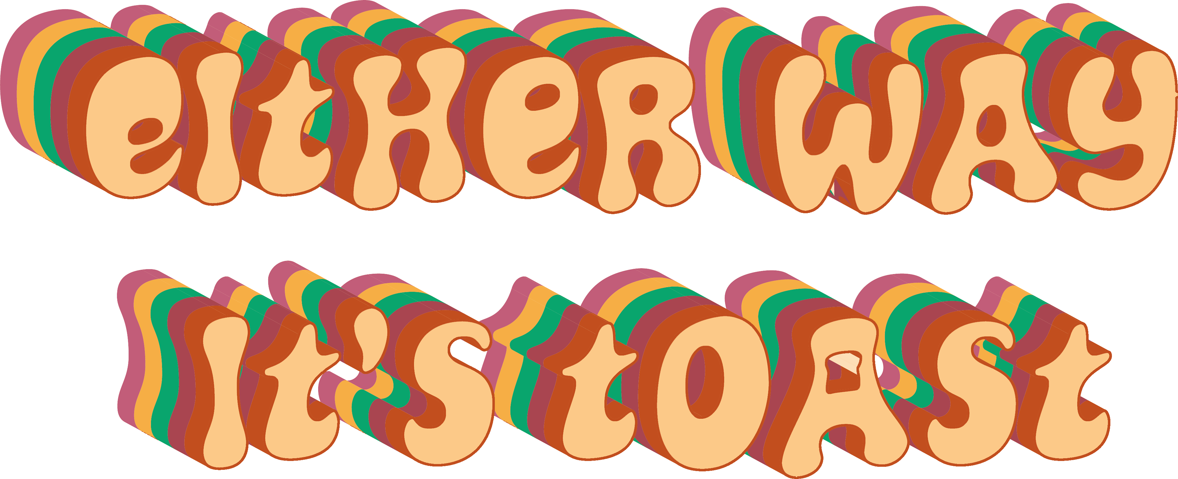
Depth, Dimension, and Color
With the type locked in, we leaned into 3D effects, continuing to refine depth and angle to give the logo presence and personality.
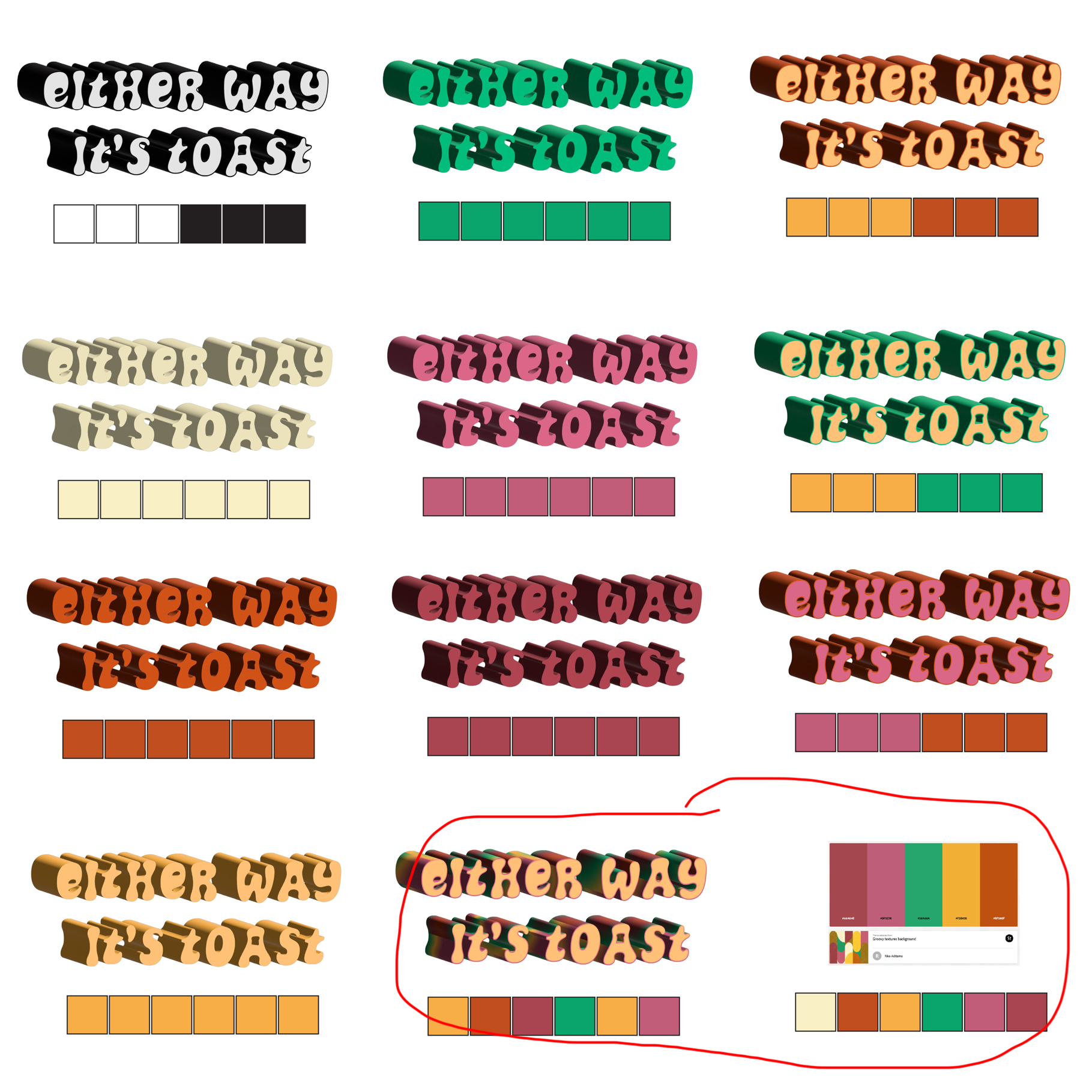
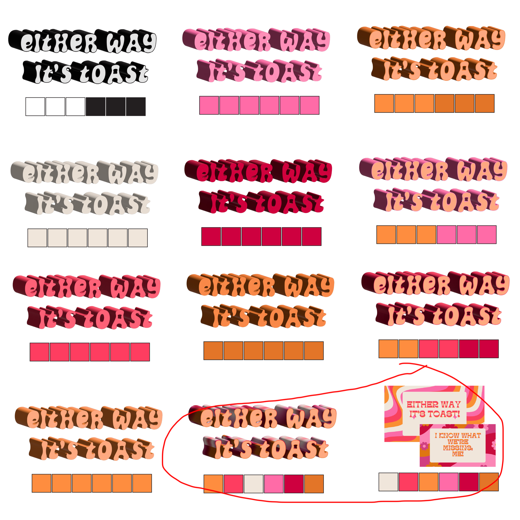
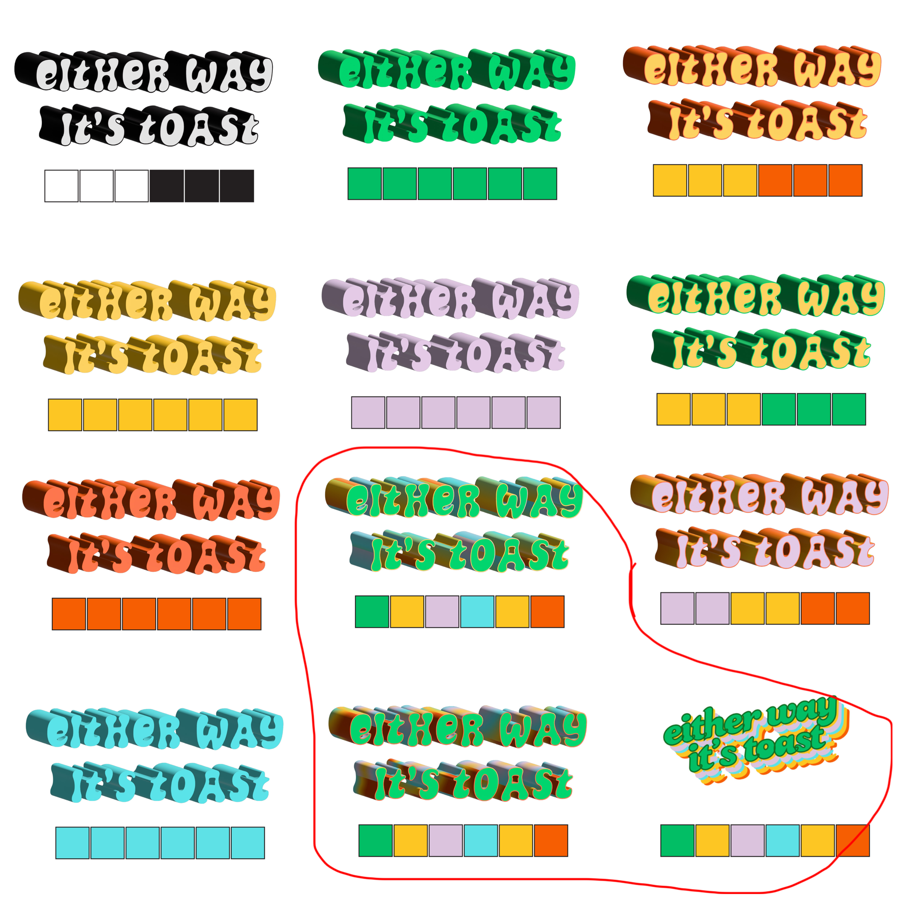
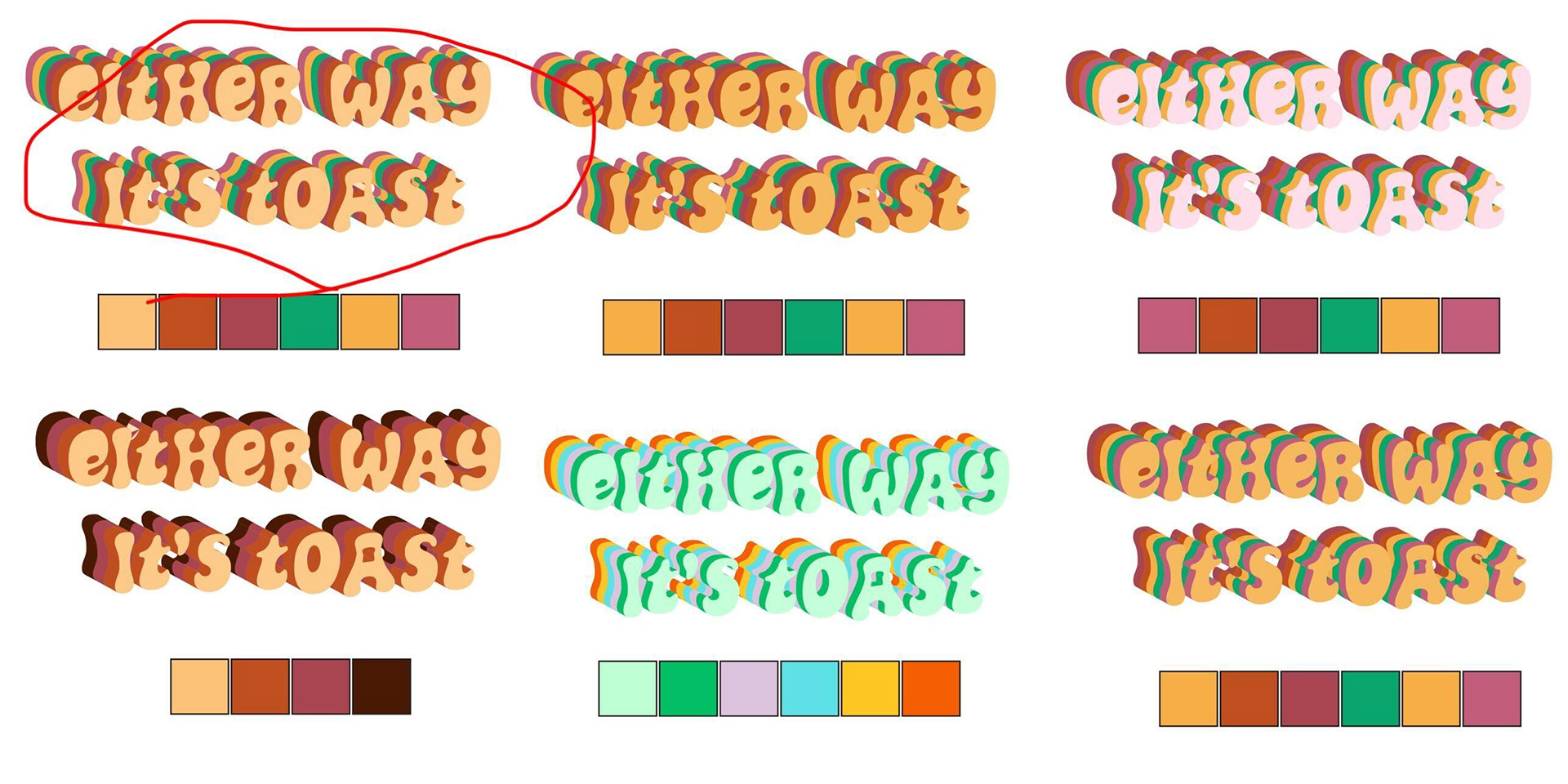
Color came next. I:
• Pulled a palette directly from Heb’s original Canva logo
• Introduced two additional palettes inspired by the idea of “groovy”
Heb gravitated toward one of the new palettes, which opened the door to a more layered look. By stacking multiple layers in the 3D effect, we were able to incorporate more than two colors without overwhelming the design.
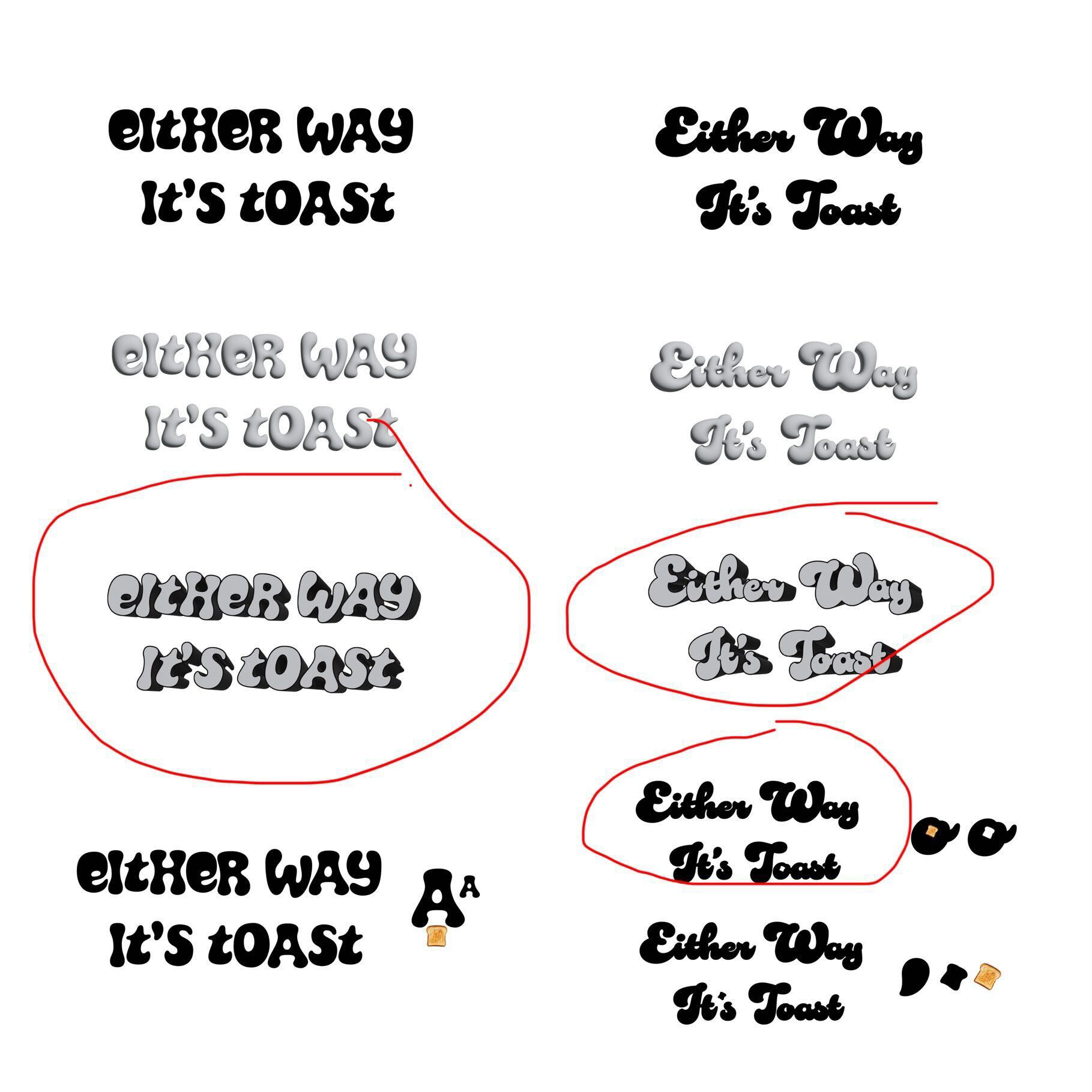
The Final Touches
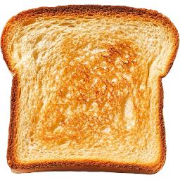
One of my favorite moments in the process was integrating a toast-shaped negative space into the “A” in Toast. It’s a subtle detail, but one that adds delight and reinforces the name without being overly literal.
After some final finessing—adjusting outlines, contrast, and overall balance—we landed on a logo that felt complete: bold, playful, and ready for the screen.


A Fast-Moving, High-Impact Project
This was a rush project by necessity. Heb wanted to release her proof-of-concept as quickly as possible, which meant moving fast without sacrificing intention.
Timeline:
• Start: November 2
• Finish: November 5
In just a few days, we moved from concept to a fully realized logo that supports a much bigger vision.
Why This Project Matters
Either Way It’s Toast is more than a logo—it’s a launchpad. It represents the early visual identity of a show concept with real potential, backed by a creator who already has reach, momentum, and a strong voice.
For me, this project was a reminder of how thoughtful design, clear collaboration, and trust in the process can come together quickly when everyone is aligned. For Heb, it’s one more step toward bringing a larger creative vision to life.
I’m excited to see where this project goes next—and proud to have played a part in shaping its first impression.